2022. 10. 21. 20:30ㆍLibrary,Framework
배워보기 시리즈는 필자도 많이 써보지 않은 스택들을 사용하면서 공식문서 바탕으로 이해한 내용들을 정리하는 시리즈이기 때문에 잘못된 부분이 있을 수 있습니다. 잘못된 부분을 발견하신다면 댓글로 남겨주시면 수정하도록 하겠습니다.
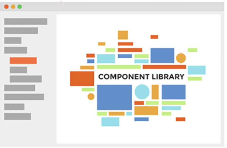
스토리북이란?
스토리북은 컴포넌트 개발을 좀 더 효율적으로 할 수 있도록 도와주고, 유지 보수 및 테스트를 보다 손쉽게 할 수 있도록 해주는 도구입니다. 타입스크립트를 쓰면 개발자의 의도가 좀 더 명확하게 기술되어 좀 더 예측 가능한 코드를 작성할 수 있듯이, 스토리북이라는 도구를 사용하면 팀원들이 각 다른 컴포넌트를 개발한다 해도 해당 컴포넌트의 사용 예제 라던지 전달받는 prop 등을 상세히 명시할 수가 있기 때문에 유용합니다. 만약 팀원들이 만든 컴포넌트를 테스트해보기 위해 매번 임의의 페이지를 만들고 해당 컴포넌트를 불러와서 일일이 테스트를 해보셨다면 스토리북 하나로 그 수고를 덜어낼 수 있습니다. 또, 추후에 문서화를 해야 할 일이 생긴다면 여러 컴포넌트가 담겨있는 스토리북을 배포하여 해당 링크를 공유할 수도 있습니다.
스토리북 사용해보기
스토리북을 사용해 진행한 프로젝트가 있긴하지만 버전이 많이 달라졌을 것으로 예상이 되므로 storybook-tutorial이라는 새로운 프로젝트 레포에 스토리북을 설치해주고 진행해보도록 하겠습니다.
완성된 예시의 레포는 해당 링크를 참고해주세요.
npx create-react-app storybook-tutorial
npx storybook init

> Need to install the following packages:
  storybook
Ok to proceed? (y) -> Enter
설치를 완료하고 아래 명령어를 입력하시면 포트 6000번대에 스토리북 브라우저가 켜지게 됩니다.
npm run storybook
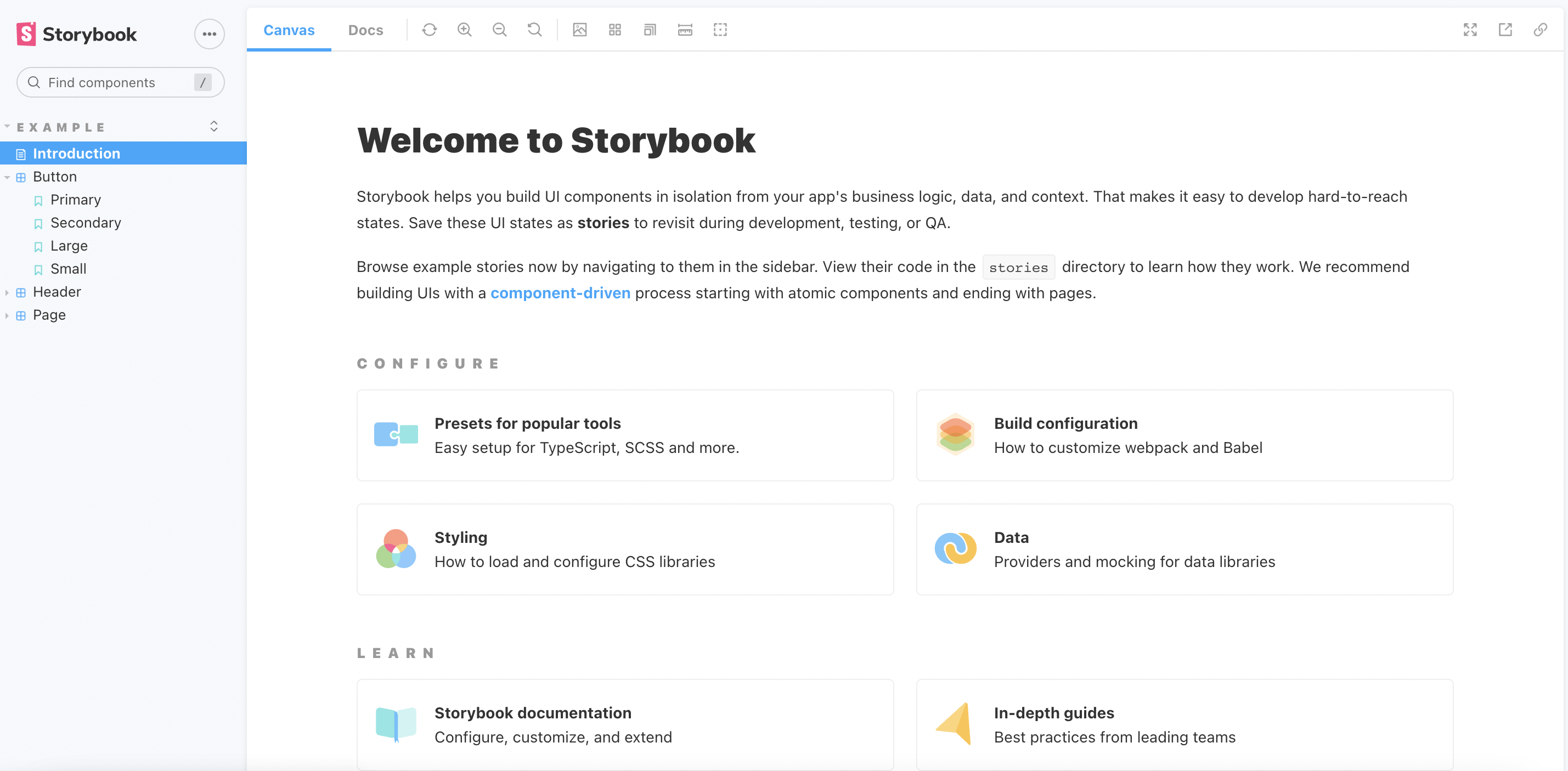
좌측 사이드바에 보이는바와 같이 기본적으로 Button, Header, Page 컴포넌트가 예시로 생성되어 있습니다.
해당 예시들은 스토리북 설치시 stories라는 폴더에 자동으로 생성되기 때문에 사용하지 않으시면 폴더를 통째로 삭제해주셔도 됩니다.
필자는 버튼 컴포넌트를 만들고 해당 컴포넌트에 상응하는 stories 파일을 만들어줄 예정이기에 우선 components 폴더에 Button.jsx를 만들어보겠습니다. 이미 테스트해볼 컴포넌트가 있으시다면 해당 컴포넌트를 사용하시면 됩니다.
아래 버튼 컴포넌트는 styled-component와 애니메이션 효과를 위해 framer-motion을 사용하였고 타입스크립트를 적용하지 않았기 때문에 prop-types으로 props의 타입을 지정해주었습니다.
// 예전에 진행했던 SUITS 프로젝트에서 가져온 버튼 컴포넌트
// https://github.com/TEAM-SUITS/Suits/blob/main/client/src/components/Button/Button.js

import React from "react";
import styled, { css } from "styled-components";
import Icon from "./Icon/Icon.jsx";
import {
  museoMedium,
  textShadow,
  themeColor,
} from "../styles/common.styled.js";
import { string, node, bool } from "prop-types";
import { motion } from "framer-motion";

/* ---------------------------- styled components --------------------------- */

const StyledButton = styled(motion.button)`
  display: flex;
  align-items: center;
  justify-content: space-around;
  text-align: center;
  width: ${({ $width }) => ($width ? $width : "auto")};
  height: ${({ $height }) => ($height ? $height : "auto")};
  ${museoMedium}
  ${textShadow};
  border: "1px solid #000";
  color: #000;
  background-color: ${themeColor};
  cursor: ${({ disabled }) => (disabled ? "not-allowed" : "pointer")};
  ${({ rounded }) =>
    rounded &&
    css`
      border-radius: 1em;
      padding: 0.825em;
    `};
`;


/* ------------------------------------------------------------------------- */

export default function Button({
  icon,
  rounded,
  children,
  width,
  height,
  isLoading,
  disabled,
  title,
  isMobile,
  ...restProps
}) {
  return (
    <StyledButton
      whileHover={isMobile ? null : { scale: 1.1 }}
      rounded={rounded}
      $width={width}
      $height={height}
      disabled={disabled}
      {...restProps}
    >
      {icon && <Icon type={icon} title={title} />}
      {isLoading ? "Loading..." : children}
    </StyledButton>
  );
}

/* -------------------------------- proptypes ------------------------------- */

Button.propTypes = {
  rounded: bool,
  children: node,
  icon: string,
  width: string,
  height: string,
  isLoading: bool,
  disabled: bool,
  title: string,
};
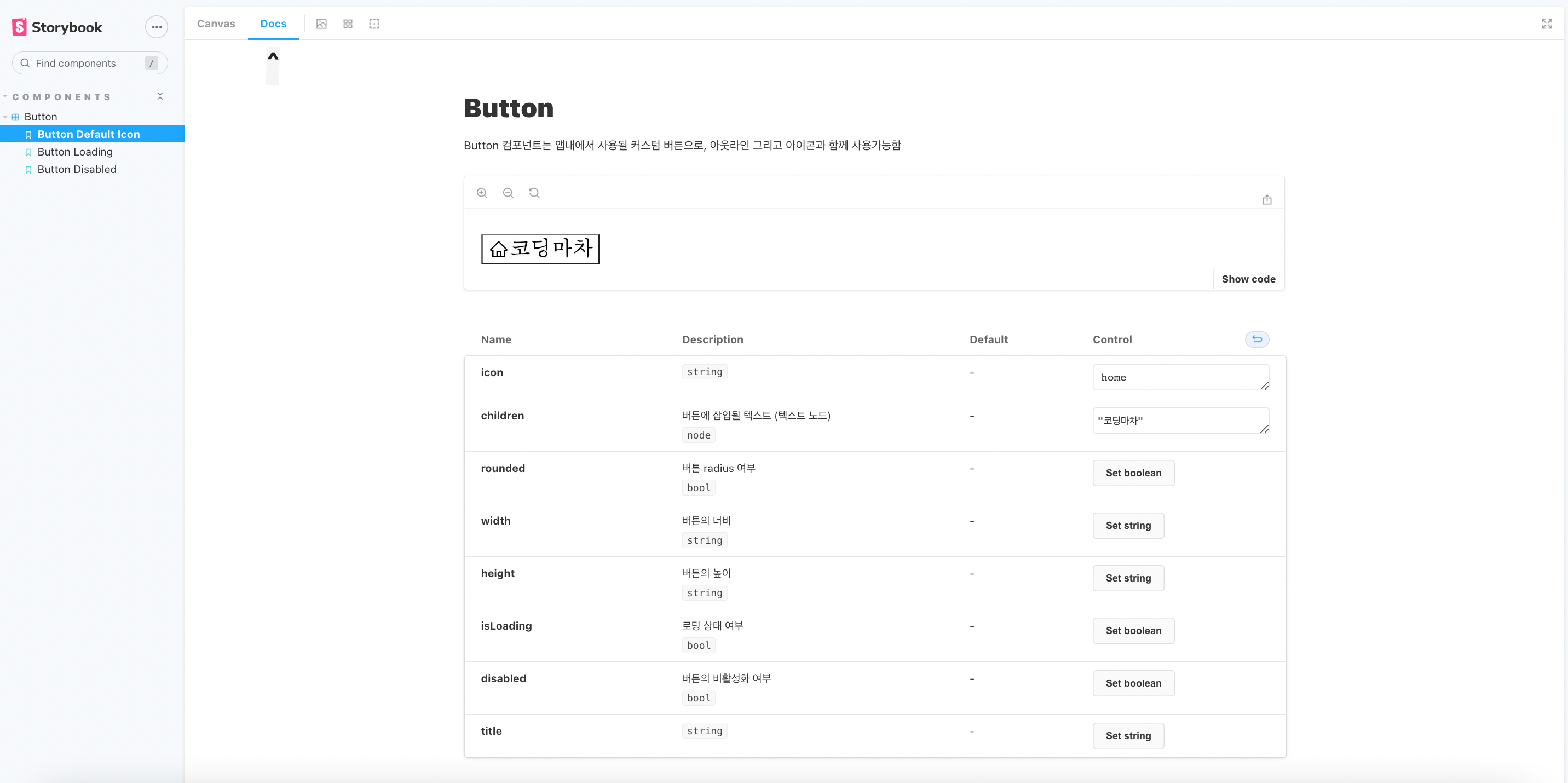
이제 스토리 파일을 만들어 줄 차례입니다.
같은 디렉토리에 Button.stories.js 확장자의 파일을 만들어주도록 하겠습니다.
title이랑 parameters는 선택 값이지만 component에는 아래와 같이 불러온 컴포넌트를 명시해주셔야 합니다. argTypes도 마찬가지로 컴포넌트에 전달되는 prop의 설명을 게시하고 싶을 경우 써주시면 됩니다.
그리고 전달받는 prop 에 따라 어떤 식으로 랜더링이 되어야 하는지 예시 템플릿을 만들어 놓기 위해서는 이름을 지정해주고 아래와 같이 args값을 지정해주시면 됩니다.
import Button from './Button';

/* -------------------------------------------------------------------------- */

export default {
  title: "Components/Button",
  component: Button,
  parameters: {
    docs: {
      description: {
        component:
          "Button 컴포넌트는 앱내에서 사용될 커스텀 버튼으로, 아웃라인 그리고 아이콘과 함께 사용가능함",
      },
    },
  },
  argTypes: {
    rounded: {
      description: "버튼 radius 여부",
    },

    icon: {
      decription: "버튼 좌측에 추가할 아이콘 이름",
    },

    width: {
      description: "버튼의 너비",
    },
    height: {
      description: "버튼의 높이 ",
    },
    children: {
      description: "버튼에 삽입될 텍스트 (텍스트 노드)",
    },
    isLoading: {
      description: "로딩 상태 여부 ",
    },
    disabled: {
      description: "버튼의 비활성화 여부",
    },
  },
};

/* -------------------------------------------------------------------------- */


// 템플릿 지정해주기 (props에 따라 어떻게 랜더링이 되야하는지 보여주기 위함)
const Template = (args) => <Button {...args} />;

export const ButtonDefaultIcon = Template.bind({});
export const ButtonLoading = Template.bind({});
export const ButtonDisabled = Template.bind({});

ButtonDefaultIcon.args = {
  icon: "home",
  children: "코딩마차",
};

ButtonLoading.args = {
  icon: "home",
  isLoading: true,
};

ButtonDisabled.args = {
  children: "비활성화",
  disabled: true,
};
위와 같이 사용할 수 있는 prop(또는 arguments)들을 입력해주시면 스토리북을 실행했을때 나오는 docs 메뉴에서 문서화된 내용을 확인하실 수 있습니다.
아마 여기까지 진행하신분들은 랜더링 된 컴포넌트에 스타일링이 제대로 적용되지 않은 부분을 눈치채셨을 겁니다.
이건 스토리북에 스타일을 별도로 적용해주지 않았기 때문이기에 다음 2편에서는 스타일링을 함께 적용해보도록 하겠습니다.
참고자료:
Args
Storybook is a frontend workshop for building UI components and pages in isolation. Thousands of teams use it for UI development, testing, and documentation. It’s open source and free.
storybook.js.org
'Library,Framework' 카테고리의 다른 글
| [react-notion-x] 노션 컨텐츠 홈페이지에서 불러오기 (feat.NEXT.JS) (7) | 2023.06.06 |
|---|---|
| Next JS 13 적용해보기 - App Routing 편 (2) | 2023.03.05 |
| React Hook Form과 외부 라이브러리 연동하기 (react-select, react-datePicker, antd, mui 등) (3) | 2022.07.22 |
| Next JS 코드 스플리팅 적용해보기 (Dynamic Import) (0) | 2022.07.03 |
| [Next.js] 커스텀 404 에러 페이지 만들기 (3) | 2022.05.07 |